
I am releasing an EP for 'Life and Limb' and designing artwork with the hope of thematically linking individual releases, the bands visual identity and creating an incentive to own beautiful and considered art work / packaging.
________________________________
Design Faculty Graduate show, UTS, Sydney, 8/12/2010 - 19/12/2010
I Presented my concept and designs in my Honours year graduate show.
Here are some photos of the exhibition.


________________________________
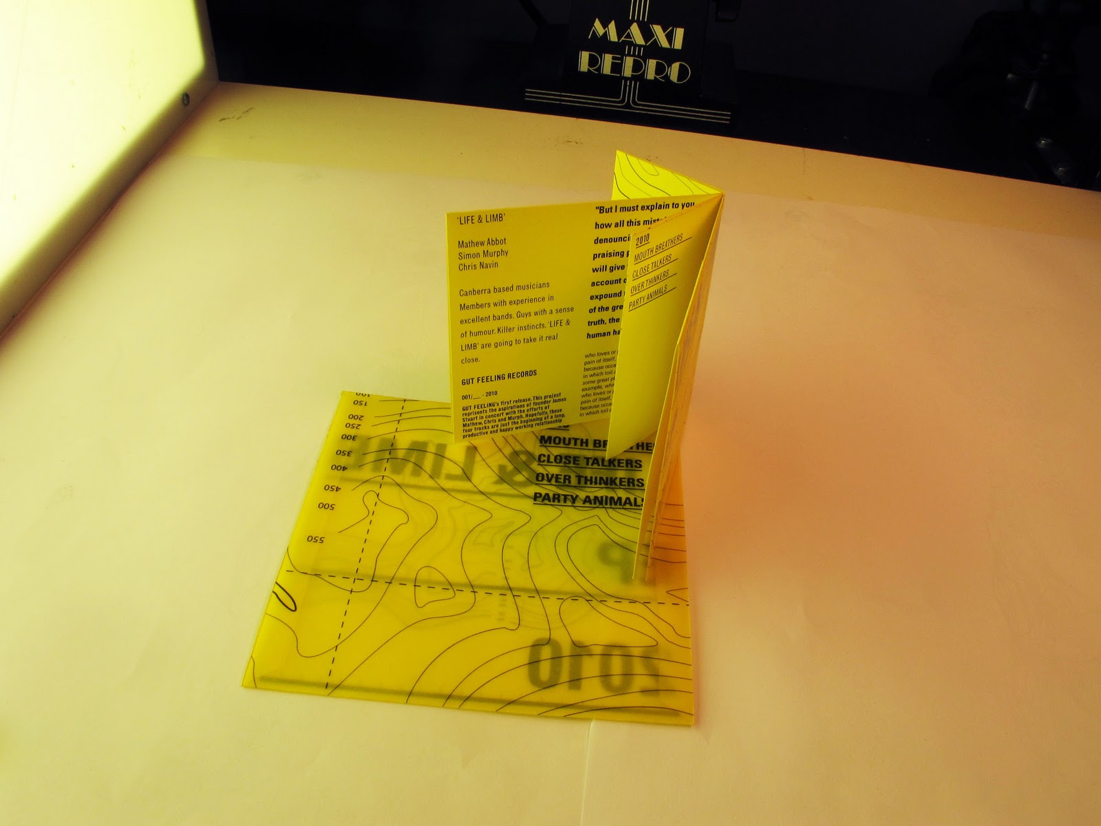
DAB Photo Studio, Sydney, 24/11/2010
Finally, the product of my product shoot. Displayed here are all of the final artwork and packaging deliverables for 'Life & Limbs' upcoming release.
Enjoy.


__________________________
THE INTERNET, EARTH, 2010
After our 10" EP is out and selling I will release our EP online.
I have taken the effort to brand the files so they distinctly represent our 'B(R)and ID'.
The files have unique 'Icons' and are embedded with meta data allowing each MP3 to come with track information and artwork.


_____________________
UTS, Sydney, 04/11/2010
My inspiration for the yellow type over images of the islands came from one particularly striking example:


The striking yellow type of the TNI - Riot Control Division's PHH has stuck in my memory since childhood. I must have first seen this yellow employed on the streets of Jakarta during and after the the May 1998 deposition of Soeharto. A friend and I used to travel over to the Senayan sports complex, under the diving pool, and race go carts for a fare of 20,000 RP. This was after our evacuation and subsequent return and the presence of the military on Jakarta's streets was still strong. Under the stands at the pool complex there was an encampment of Indonesian Marines and their allocation of riot control equipment; Pistols, Assault Rifles, tazers, shields, helmets, and not least PHH ponchos. We used to talk to them, play with their stuff and have them watch over us as we raced go carts around, practicing our donuts. We explored many parts of that sporting complex, the two of us, just as we did the tunnels leading from the Hilton to the national convention centre and the entire complex at gargantuan, then Hilton, complex. Indonesia is a fascinating place. I remember stumbling across people living inside the giant Senayan Stadium and watching kids practice Football, Volley Ball and bizarrely enough, Baseball in the caverns within the stadium. We experienced all of this between the ages of 10 and 11. Those were formative years.


...
_________________________
Surry Hills, Sydney, 03/11/2010
My Process journal has been a mess this entire semester. Ideas have been scribbled down across different note books and onto random bits of paper. Here are some bad pictures of the bad book.


 |
| my book, |
VIDEO EDITING QUAGMIRE, SYDNEY, C. 03/11/2010
I needed to address the question of how a video element to this suite of branding would be considered and I have done so. Shown through these two examples is the stylistic approach of this release when coupled with the video format. Each sequence demonstrates different evocative qualities of the music and visual language. Here are the final colour grades.
I had many format and colour grading issues so suffice to say these videos took a long time to get through the pipeline.
Thanks actors, Thanks models, Thanks Alex Ryan, Thanks Robyn, Thanks Paul Pavlou, Thanks Jenny, Thanks smoke machine, Thanks Luke, Thanks Adrian, Thanks Mike...
Here are some stills:


________________________________________________________
PHILIP'S SCREEN PRINTING DUNGEON, UTS, SYDNEY, 02/11/2010
After coming up with variations of my Logo and Map design for T-shirts and patches I took my artwork in to Philip Inwood of the UTS Fashion department to make up some merchandise for the band. While the artwork for the sleeve depends heavily on high resolution, full colour imagery I wanted 'Life & Limb's' merchandise to comprise simple, one colour prints on yellow shirts and patches. If done this way the shirts and patches would be easy to produce by me or anyone else in future at the lowest possible cost.
Here they are:
 |
| Pre-printing-yellow-shirt-monster |

 |
| Philip's screen printing world |
 |
| essentials |

 | ||
| A T-shirt. OK |

 |
| Our shirts |
 |
| Our patches |
Get on the bandwagon, pick up some shirts and patches at our shows through January.
_______________________________________________________________
BABABA INTERNATIONAL TERMINAL, East Redfern, Sydney C. 25/10/2010
The 'Life & Limb' website, worked on by Stephen and Ivan of BABABA INTERNATIONAL and myself is now ready to present. The website serves as a jumping off point to all of the bands disparate social networking accounts as well as serving as some vital web real estate upon which to demonstrate the rich aesthetic character of the upcoming release. It doesn't have hosting yet so here are some stills:

 | ||
| If you watch the homepage long enough you will see that mist cascades across the islands |
 |
| The gallery page, where one can see many different sides of the archipelago |

 |
| Beautiful vantage point. |

 |
| The tumblr (used to post dates and news) and the myspace page |
____________________________________________
DAB BUILDING SIX.... UTS, SYDNEY, 23/10/2010
Everything is wrapping up now - many updates soon.
I have been developing the use of my visual language or style guide in video format
the cult followers of Life and Limb .
What is going on in this video?
"Who carries a musical release to success? Who is responsible for the rise of a given piece to cult status?
The first cohort of followers, those who evangelise the name and spread the message, these are the most important people. This video shows the character and sensibilities of a few of the people who comprise this cult."
more refinement to come.
This is not colour graded yet
Some things to come:
Final Packaging refinement. Making of insert / booklet. Final model making process shoot.
Finished patches.
Thank you Tom Wyburn for the Ambient track.
______________________________________________
PHOTO STUDIO, UTS, SYDNEY 12/10/2010
Here are some more or less unedited photos from my final shoot with the islands...


After eight or so shoots, I finally have the shots I need!
______________________________________________
'I AM HERE EVERYDAY' - PLACE, Sydney, 11/10/2010
Corporate Identity and Punk have something in common. The logotype.


 |
| eh - not a band |


 |
| tribo-location: backpatches unite! |
 |
| 'CONAN - what is best in life?' |
ALSO! here is the 10" artwork so far:

__________________________
LAB-Dungeon, Sydney 04/10/2010
For over a month I have been working with layouts, packaging and complex folding solutions for this series of releases. Some time ago I came up with the idea that I could create a rich suite of auxiliary visual language through the rendition of Topographic maps which represented my island chain. This is being done so that the central theme can be referenced in instances where full colour - hi resolution images cannot be printed. My 'maps' can be used in one colour printing situations, stencil pressing for booklets + flyers, screen printing for paper, patches and clothing and the like. Great Job!
This stuff demonstrates some of my process and the evolution of the artwork so far...
 |
| The original map elements in print template |
 |
| New map work in progress |
 |
| " " |

 |
| This took FOREVER |
The re-working of the maps was intended to add a greater level of detail as well as create a close relationship between the aesthetic and shape of the islands in the photos and those shown on the map.
The whole time I worked on this I was listening to this:
I love this song.
And some packaging...
 |
| Early cover process renditions |
 |
| Working with one colour printing on colour stock for booklets and and other collateral |
 |
| Inner sleeve |
 |
| Type + image experimentation |
 |
| Further Experimentation |
 |
| Fairly basic but a clear Direction none the less |
 |
| A working mock up |


'No life till leather'
oh P.S
the recording went pretty well. Too much Rock and Rorr not enough Outer Space if you know what I mean. Not bad for a First EP, It will come along.
_______________________________________
The 'Life & Limb' Crypt, ACT,SYD, 22/04/2010
We secretly released rough demo's of our first tracks earlier this year. Limited to a quanitity of sixty, these demo/demos went like hot cakes. Some of the mystery buyers include: George Clooney, Werner Herzog, Bob Hawk and Wim Crouell...
These demos are packaged in a four tiered CD sleeve which unfolds to be constructed into a cube after opening. Included is a unique coloured CD, unique to six individual labels handling these demos around the world, and a poster/booklet. Collect all six colours to spell the possible ANAGRAM titles of the EP. Some say 'DR RAPE', some say 'PADRES' and some say 'DRAPES'... the possibilities are... around 46.. not endless.
HERE...


 |
| Unique promotional booklets |


 |
| gnarly... |
Just kidding...
___________________________________________________________________
RESEARCH VAULT, SYDNEY, MELBOURNE, NYC, CANBERRA, 15/04/2010
Shown below is some of the extensive research conducted earlier in the year into 'design for music publishing'. Throughout my literature review, interviews and observation studies of music listening rituals I kept rigorous notes and collated all of my findings into documents and posters intended to demonstrate my research visually. Aside from looking into music publications, design for music and other primary music or design related sources I also looked into some very interesting sources regarding 'art in the age of mechanical reproducibility'. the essay 'Art in the Age of Mechanical Reproducibility' by Walter Benjamin helped frame my project as did other writings which reference Benjamin's thinking like Theodore Gracyk's 'Rhythm and Noise, An Aesthetics of Rock'.


 |
| more gross old 'Life & Limb' posters |
__________________________
Photo Studio, Sydney 01/10/2010
I finished off my model islands and look them into the studio to begin 'shooting' them.
It is a tricky business shooting a bunch of mounds and trying to come up with compelling imagery which could be used on packaging.
 |
| Studio set up |
 |
| Finished Islands |
 |
| Archipelago all painted! |
 |
| Complex cardboard |


 |
| One of the 'test' islands - sans light |
 |
| Lights - ambience |
 |
| I tried shooting the models in water... Wet and eventually mouldy |
Over these early studio sessions I experimented with different exposures and set ups, allowing plenty of time for development and error.
 |
| Too much 'garbage bag ocean' |
 |
| Gross exposure |


The Archipelago begins to come together... It is a strange sensation to see an idea which came into your imagination whilst flying out from Lantau Island HK come to fruition so many months later in a basement in Sydney.
__________________________
Surry Hills, Sydney, 30/09/2010
I have been experimenting with model making materials.
Clay was a disaster. It cracks, it is too heavy, it contorts the surface it is applied to...
I decided to go ahead and finish off the construction of the final 'archipelago' using my paper construction method. Here is what ensued.
 |
My final chain of islands and their 'footprint' came from this mindless little sketch. - ONE : 1 as in EP # 1... |
 |
| Paper island construction |
 |
| Cooking up glue! |
 |
| Glue-mad |
 |
| Glue application |

Find Conan - Island Making
 |
| 1 - 2 - 3 |
 |
| I stopped making Islands to make Pizza! |
 |
| mmm |
 |
| Hedonism |
 |
| Islands with base coat of grey |
 |
| This awesome! Swiss Type meets senility meets jungle |
 |
| I have been consuming A LOT of 'Indo Mie' |
__________________________
Surry Hills, Sydney, 21/09/2010
Making models...
Making models...
Preparing to record...
THIS WEEKEND!
at 'Infidel Studios' in QUENBEYAN - country NSW!


 | |
| We will miss you 'Jam Factory' - Thank you Christo for all the great memories. |
__________________________
UTS DAB, Sydney, 06/09/2010
Today I pitched three concepts for the 2010 UTS DAB grad show with our design team / group. After a wet (Miso + egg) lunch I regrouped in the secret cavern, drank coffee, listened to Philip Glass on loop and worked on some graphics for my project.
UPDATE:
-ugly, clunky, yellow, old hat, cutting edge for 1962, design school, what ever, etc...


Here are some examples of prospective imagery (place holders which posses the evocative qualities of content IIII will produce in the coming weeks) coupled with some type and Vector art ideas I am meddling with.
The Beautiful images of the rocks in water come from:
Lake Tuve
by Kim Holtermand, Sweden
In my procrastinations today I came across a Japanese school of Architectural thinking / UK experimental Electro group:
 |
| music |
METABOLIST were a short-lived UK experimental group forming in January '77; consisting of Malcolm Lane (guitar, synth, vocals), Simon Millward (bass, vocals, synth) and Mark Rowlatt (drums, percussion), with Jacqueline Bailey dedicated to cover designs. Within the UK press their sound was roughly lumped alongside several other UK experimentalists, The Pop Group, Cabaret Voltaire, Throbbing Gristle & This Heat. While tied to many preconceived conceptions, "a poor mans This Heat" comes as a classic example; the group procured a different sound upon each release. Asides from British counterparts, the band also claimed influences from Can, Gong and Magma...
 |
| tree house urbanism, trunk |
METABOLISM, Japan:
In the late 1950s a small group of young Japanese architects and designers joined forces under the title of "Metabolism". Their visions for cities of the future inhabited by a mass society were characterized by large scale, flexible, and expandable structures that evoked the processes of organic growth. In their view, the traditional laws of fixed form and function were obsolete. Metabolism arose in post-World War II Japan, and so much of the work produced by the movement is primarily concerned with housing issues.
The group's work is often called technocratic and their designs are described as avant-garde with a rhetorical character. The work of the Metabolists has often been compared to the unbuilt designs ofArchigram.[1]
-Wiki
+ I like this:
This is his 'Gift'. Hence the title 'Gift'. We shall see how long that stays the title for...
__________________________
Surry Hills, Sydney, 04/09/2010
Dazzle Camouflage:
I just really like it!
Sometimes when you are exploring aesthetic or stylistic possibilities for a project you come across something you really like but can't figure out how to marry across other pre-existing elements. 'Dazzle camoflage' was a large scale pattern applied to ships and aircraft during the First and part of the Second World War. This accidental beauty was rendered obsolete when Naval Aviation came to the fore as the decisive weapon on the seas. This unique camouflage was intended to confuse those taking a bead on a target by obscuring the outline and possible trajectory of the craft in question. This pattern was not intended to hide a craft so much as to obscure it's silhouette. From an airborne vantage point Dazzle just wasn't ... dazzling enough.
Strong looking:


UTS, Sydney, 31/08/2010
I have covered a lot of ground in developing my research and visual trajectory over the last few weeks. I now need to engage in the primary development of ONE idea or theme which Will lead to the final outcome for my 'Music Publishing' project. While this will happen over time it is now essential to move past the more open visual and generative research I have been engaged in.
My finalised brief has been Submitted:
 |
| -1- |
 |
| -2- |
 |
| -3- |
 |
| -4- |
 |
| -5- |
I have begun plotting out the 'Internet Realestate' we will need as well as thinking about the template for CD and VINYL packaging. SEND ME ANYTHING INTERESTING YOU THINK I SHOULD KNOW ABOUT PLEASE: james.i.r.stuart@gmail.com
 |
| 'Why smile when I have nothing left to smile about' - Ian Stuart |
I really get a lot out of spending time with my elders.
__________________________
Surry Hills, Sydney, 30/08/2010
I have been conducting some further generative research into the construction of small islands illuminated by LED lights.
The idea is that I render a series of islands as the sort of ' identity' for this packaging or branding exercise.
Islands are a fitting 'character' for my project as they can understandably be portrayed as independent entities as well as collectively in an Archipelago. My goal is to show one 'Island' on each release therefor suggesting that if one owns them all they collect the entire music 'Archipelago'.This thinking is on the eccentric, goofy side of the spectrum for sure.
In relation to the LED lights included in these models. I wish for the exposing light or illumination in these images to come from a source in situ. Also, I feel that the coloured light over the grey hillsides evokes themes which have been reoccurring throughout my visual research. Again these themes of light, architecture and landscape have left a huge impression on me over time.


'Limb Island'


I also played with light and small cardboard models of modern towers. These could help render these islands with more life or act as an alternative primary aesthetic or thematic component. I like 'Brutalist' towers... Why do you think I chose to study here:

I may just end up making paper Archipelago of the imagination...
UTS, Sydney, 28/08/2010
I have been conducting some Video exercises into masking and revealing content. The character of these geometric forms is intended to reference and express some of the stylistic themes emerging through my research without directly representing them. Instead of rendering these typographic, architectural or photographic styles I have chosen a more abstract approach.
In these examples I am also looking at alternate was in which I can reveal something over time or across a spectrum of media.
... sometimes you have to DO something to truly know it was never worth doing.
One thing I enjoy about design is the 'thinking in action'. It is nice to be free to learn from experience and not left only to speculate on these ideas.
_____________________
UTS, Sydney, 27/08/2010
Here is my response to my research into 'T.V Idents' so far...
.
I hope this has left some impression on me. The hope was to arrive at some kind of Typographic / stylistic approach to the 'Identity' treatment. I can feel a breakthrough coming.
_____________________
UTS, Sydney, 17/08/2010
Since my shift as teacher's aide to the second year motion graphics students today I haven't been able to stop thinking about 'Idents'. 'Idents' are those things that place after a TV show ends or the '20th Century Fox' logo that always comes on before 'The Simpsons'. Today I have been looking at some 'Idents' from the the 1980's in the hope that I can find some inspiration for some of the type-signage I have been experimenting with. Here are some examples:


I also came across a bunch of bad horror films who's titles had the bold, garish typography I am looking for!


I am working on some type-montages. They will be ready soon!
All day of my life today I have been listening to: Elvis Costello, The Jam, Prabu Deva, The The, The Beautiful South, The Housemartins & KATE BUSH.
P.S This song... !!!
COMPUTER CAVE, EAST COAST, AUSTRALIA 17/08/2010
I have been listening to some pretty crummy 'Life & Limb' takes for a few hours and I am pretty convinced this is going to be an awesome band. Total-ly!
I have been trapped on the wrong side of a door inside of a study cave with my French pal Adrien all day. There is no phone signal here but a lot of Internet. I have achieved a small amount. Most importantly we drank pearl river and ate at my new secret favourite second floor Japanese cave-raunt. I feel like one of the 'Trogolodytes' in that film 'Delicatessen'.

I am working on a rough Brief for my 'Major Project' for next week.
In my procrastinations I came across some great work from the Japanese artist 'Masakatsu Sashi' spanning the years 1996 to 2010. I actually came across these because I was conducting a 'Google Image Search' for the band 'Weather Report'. One of Masakatsu's works is titled 'Weather Report' so naturally it appeared. This is how we live in 2010.
 | ||||
" BAZAAR "
2007 Oil on Canvas 112 ×162cm |
 |
" マーチ "
2009 Oil on Canvas 227.3 ×181.8cm |
 |
" planet"
2010 oil on canvas 162 ×130.3cm |
 | |
" PLANET "
2005 Oil on Canvas 45.5 ×38cm |
 | |
" 刻の功 "
2005 Oil on Canvas 162 ×130.3cm |
 |
" Weather report "
2005 Oil on Panel 31.2 ×31.2cm |
 |
" World in the pocket "
2003 Oil on Canvas 116.7 ×116.7cm |
 |
| " TANX " 2009 oil on canvas 95.0 ×120.7cm |
 |
" Born To Boogie"
2009 oil on canvas 114.0 ×164.0cm |
This stuff is super relevant to my 'World Construction' theme and it is just great anyway!
Go check it out!
 |
| my heart is an apple crumble |
Also this girl is a babe on the inside and the out!
I am a lucky dude
Sydney 15/08/2010
Last week I played around with a few scenes which I felt would convey some of the key aesthetics / 'landscapes' for my project. I decided to make them short 'Animatics' or animations in the hope that they would feel a little more evocative.
These are very basic five second inspections of light, colour and mist which were rendered in After Effects.
City
Signs
Ridge
More to come...
________________________________
Here is some content which informs me:
Think of this as a mood board, just a sort of atmosphere for where my design, illustrative and musical sensibilities may lie...
_________________________ ________________________________
Here is some content which informs me:
Think of this as a mood board, just a sort of atmosphere for where my design, illustrative and musical sensibilities may lie...
Canberra + Sydney 09/08/2010
I have been developing an Idea where my 'Identity' and 'Packaging' design for 'Life and Limb's' upcoming release revolves around the EP's existence in a physical place. Specifically an Archipelago who's islands combine to spell 'Life and Limb'. In this little republic we could situate different Singles, digital downloads or EP-CDs. The deluxe EP packaging for the Vinyl, which would include a CD and or the download voucher for the music would reveal all of the aspects of this place.

Research

Roden - Earth Art

Something like that - made out of modelling material with tiny apartment buildings, signal lights and signage.
To promote this EP on the web I also propose to create up to three thirty second advertisements exhibiting this world in Diorama form ala a 'GI JOE' or 'Star Wars' toy commercial!
Something like this:
Go Joe
A+
When trying to express the character of this environment I would like to create it helps to draw from existing examples. The atmosphere, colour palette and approach to lighting (both of the set and protagonists and specifically the lights IN the set pieces) of THX 1138 is very evocative of the sort of ideas revolving around inside my head.
THX 1138
_________________INTERNET 06/08/2010
-Some 'light research'
Turn your sound off for most of these because it is a bit 'naff'. I will mark 'SOUND ON' for the videos where it needs to be listened to.
SOUND ON
SOUND ON
SOUND ON
Amazerbeam - SOUND ON
milk
SOUND ON
SOUND ON
Amazerbeam - SOUND ON
milk
http://www.daito.ws/#4
Daito Manabe - GREAT
Night Lights! - Daito Manabe + others
'Throwies' - no sound
More 'Throwies' - no sound
'Floaties' - no sound
Floating light - no sound
'Light Atmosphere' - no sound
An interesting look at some vapour and light - no sound
At this point I am beginning to look into how I can fabricate and arrange some light displays of my own to use as the basis for designing some promotions and collateral for an upcoming release.
I think Daito Manabe will be a huge influence on me !
Check out this page too:
http://rhizomatiks.com/#/works/
____________________________________________
HONG KONG 31/07/2010
Images of light, type, signage, towers, concrete, the city
I feel that these are all relevant aesthetics which should contribute to the character of the designs I have to arrive at in the coming months.
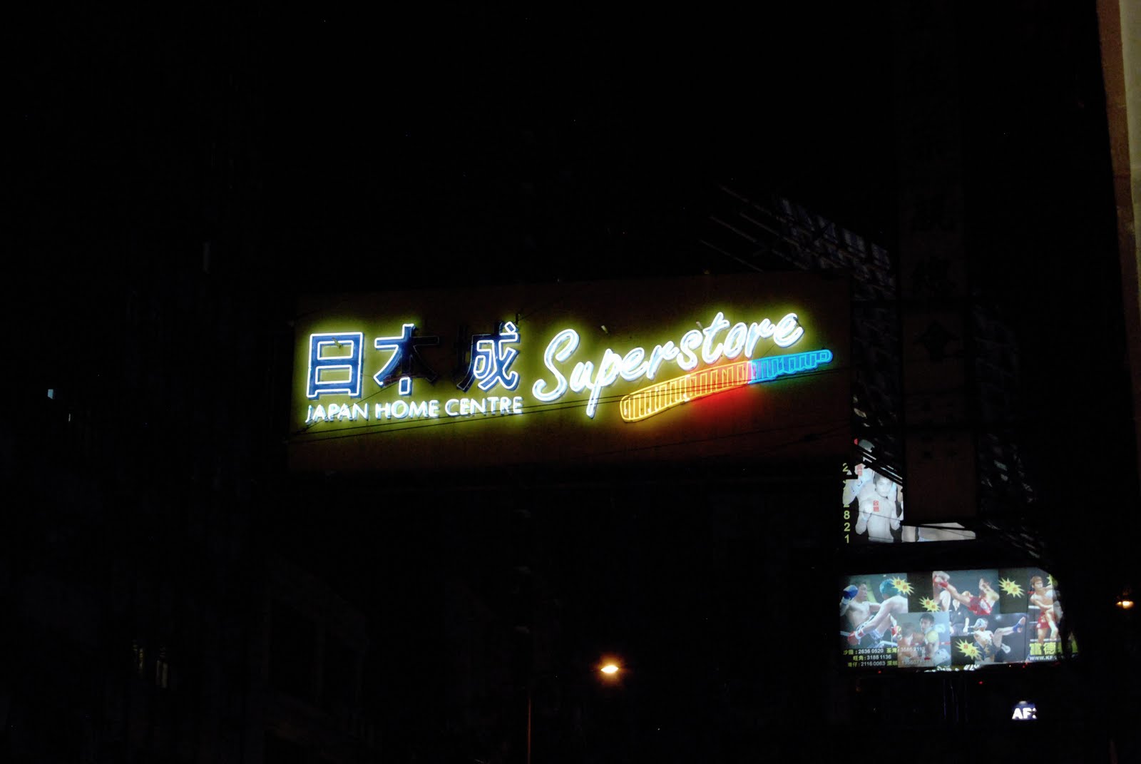
I have been traveling around Hong Kong putting myself in environments which I look back on fondly from living as an adolescent in Jakarta, New York and traveling to places like, well, Hong Kong and New York. These dense, neon and crowded spaces conjure images of 'Blade Runner', 'Akira', 'Syndicate Wars the Game' and Chris Marker's 'Sans Soleil'. They have always excited me. I have a fondness for second hand camera stores and computer malls like the one at 'Glodok' in North Jakarta which was destroyed during the unrest in 1998. It has been rebuilt. There is a building called 'Champagne Court' in Kowloon which houses a ground floor full of the best second hand camera stores I have ever seen. They have gold plated special editions of everything and mountains of camera bodies dating back 70 years.
All photos taken by me unless otherwise noted
29/07/2010 - 30/07/2010 - 31/07/2010 - 01/08/2010 - HONG KONG


Click on image to see the 'Mini Gun' for sale at the bottom

'Re-purposed waste' landslide

'Dense Urbanization'

very

- yes

"This is what you want, this is what you get!" - PiL
It was many years ago when I first saw this record sleeve and even then it turned me on. I feel like the appeal of this imagery runs deep for me. I think it has something to do with growing up in the places I did and in moving around so much. In the process I developed a sense of nostalgia for all of this bold imagery, the strong smells and the general level of activity. It was Visceral.
When I was a very small child my mother gave me some books by Donald Crews. I guess I never progressed further because the imagery and typography is still burned into my memory. It is like Wim Crouwell for kids!


Donald Crews
So it is no surprise that the famous 'Blue Circle' logo for 'The Germs' always caught my attention. And so did their music!


"What we do is secret" - Darby Crash
MADRID - 25/07/2010
Light, Image, Sound, Motion.
Inspiration for my Honours Project
Most are photos taken by me at:
Art Institute - Chicago
Museum of Contemporary Art - Chicago
Carnegie Gallery of Art - Pittsburgh
Bellas Artes - Bilbao
Museu de Artes Contemporaneo - Leon
Museu de Artes Contemporaneo - Barcelona
Reyna Sofia & Del Prado - Madrid
New Musem - New York
Leon, Spain
Bilbao, Pais Basco
Barcelona, Catalunya
Chicago, USA
Pittsburgh, USA
Washington D.C, USA
NYC, USA
Cincinnati, USA
Pittsburgh, USA
Dayton, USA
Sevilla & Cadiz & Carmona, Andalusia
Hong Kong
Canberra, Australia
Sydney, Australia
-Names of Artists follow

Roman signpost - Leon


MUSAC - Museo de Arte Contemporaneo - Leon

Light Box - Revelations are cliche - Museo de Leon


Oscar Munoz - Charcoal Projections on Water - Image, Temporal, Substrate


Transient smoke and light - MUSAC - Leon - Sorry, I missed the artist

Light - Leon - Sin Titulo


Carlos Garalcoa - How the Earth Wishes to Resemble the Sky - 2005 - MUSAC - Leon

Bar - Mundaka - I loved El Pais Basco - Just like Colonial born journalist Goerge Steer, I have fallen in love with this place, I am lucky to have some Basque blood


Greg Nauman - Art Institute - Chicago

more Nauman


Pierre Huyghes - Les Grands Ensembles - A great inspiration for my project

 Millenium Park - Chicago

 Unknown - Carnegie - Pittsburp


Doug Aitken - Migration - Carnegie - Puttsburgh - I was captivated


 Unknown - Museum of Contemporary Art - Chicago - Reflections of images in water held in oil drums - Stirring


 Alfredo Jaar - Untitled - Museum of Contemporary Art - Chicago - Colour Photography Printed on Acrylic with Fluorescent back lighting
I see Dan Flavin everywhere I go in the world
Charles Simonds - Dwellings, NYC 1971 - Reyna Sofia - Madrid - This changes everything for me
SO I AM LOOKING FOR LIGHT - 2010


CEREMONY - NEW ORDER


Doug Aitken - Migration - Carnegie - Puttsburgh - I was captivated


I see Dan Flavin everywhere I go in the world
Charles Simonds - Dwellings, NYC 1971 - Reyna Sofia - Madrid - This changes everything for me
SO I AM LOOKING FOR LIGHT - 2010
____________
Light Narrative 25/07/2010
PH I’m interested in topological systems. In San Francisco in winter 2002, I met Jaron Lanier, the inventor of virtual reality, who’s now working on analogic systems. The condition of exchanging information between two computers depends on a protocol of dialogue, and he’s working to establish a way for computers to talk to each other without protocol, based rather on recognition. That’s a beautiful idea. I’m less interested in dramatic, linear processes where there’s a planned protocol. I’m more interested in open scenarios. Douglas Coupland told Disney that the problem with their films is that they’re too efficient, too seamless. I feel like recently every film or narrative structure is becoming too efficient. There’s no time to be distracted, you know what I mean? There’s no time to find your own time in the narrative. Rather than become a part of the film, you are held at a distance from it. It then becomes only an icon. It dominates. There is no possible dialogue between it and you.
-pierre huyghes
______________________________________________________________
-pierre huyghes
______________________________________________________________
EXCITING MATTER:


_____________________________________________
THIS SONG MUST BE COVERED


more research / inspiration:


TELEGRAM SAM - YOU ARE MY MAIN MAN
YOU GIVE ME PROBLEMS ABOUT MY BUSINESS
MINIVAN HIGHWAY
THIS MELODY IS STRONG / POWERFUL